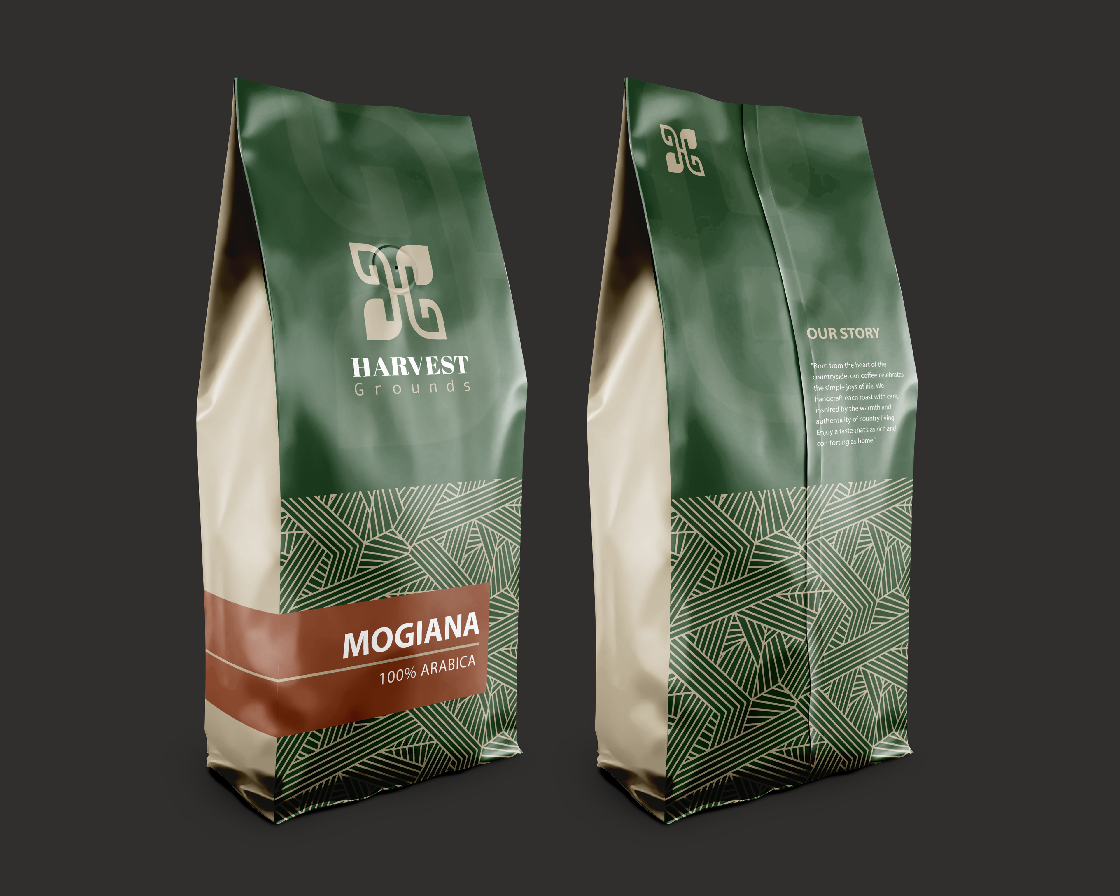
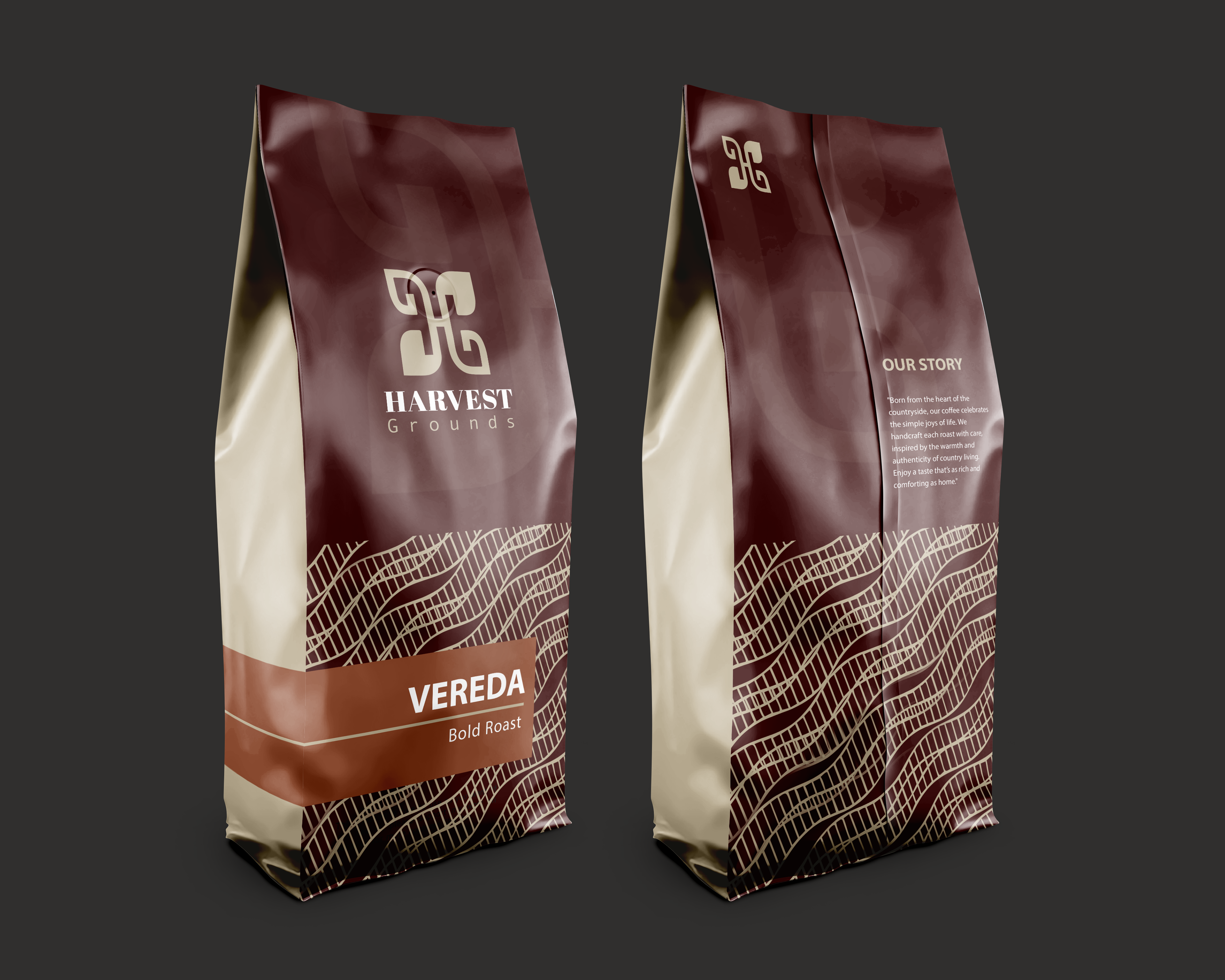
I designed the Harvest Grounds coffee packaging to embody a balance of nature and elegance. The royal green and beige color scheme reflects its organic roots while maintaining a refined aesthetic.
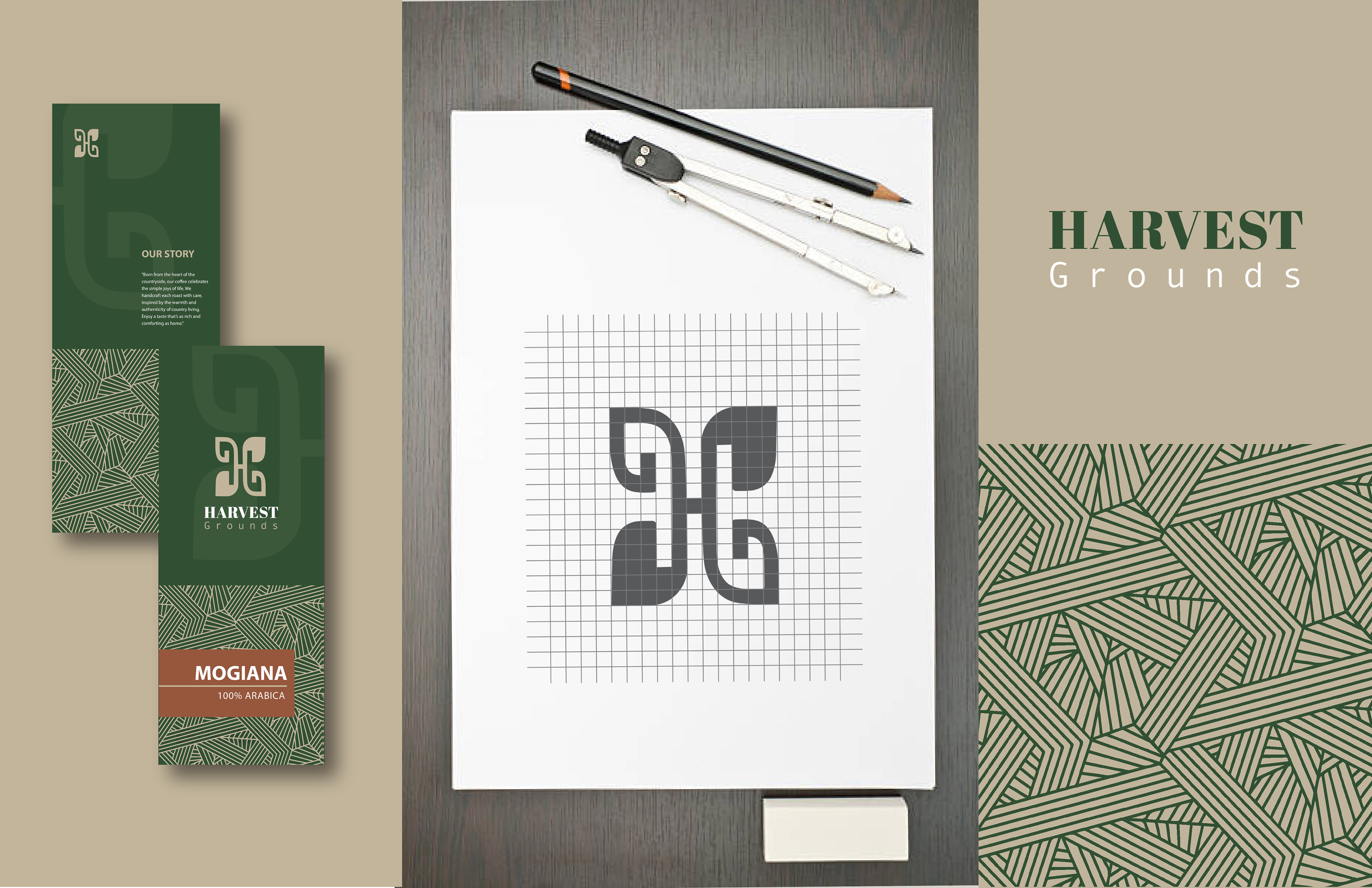
The logo features a regal "H" intertwined with leaves, symbolizing a deep connection to nature. Inspired by vast coffee fields, the intersecting lines add a grounded, country feel. The overall design remains simple, inviting, and timeless, just like the coffee itself.
The collection includes three distinct variations, each celebrating premium Brazilian coffee:
Mogiana – 100% Arabica (Smooth & balanced)
Serra – High-Altitude (Refined & elevated)
Vereda – Bold Roast (Rich & intense)
Each version maintains a unified yet distinctive look, reinforcing the quality and heritage of Harvest Grounds coffee.